可视化
更新: 2021-01-10 14:00:32
1 可视化定义,与图形学、数据挖挖掘的关系
课件:vis-intro-2020-0911
关于定义:
Tamara Munzner 2011: "Computer-based visualization systems provide visusal representations of datasets intended to help people carry out some task more effectively."
大致翻译:提供数据的呈现,帮助人类更有效率的产出。
不同领域的一些输入输出的比较:
| input | output | Research Area |
|---|---|---|
| Image | Image | Image Processing |
| Image | 3D Model | Computer Vision |
| 3D Model | Image | Computer Graphics |
| Data | Image | Visualization |
关于异同,一些未整理的理解:
数据可视化的目的,是要对数据进行可视化处理,以使得能够明确地、有效地传递信息。
数据可视分析和数据挖掘的目标都是从数据中获取信息与知识,但是手段不同。
数据可视分析是将数据呈现给用户以易于感知的图形符号,让用户交互地理解数据。数据挖掘是通过计算机自动或者半自动地获取数据隐藏的知识,并将获取的知识直接给予用户。
也就是说,数据可视化可以看到交互界面,更适合于探索性地分析数据。而数据挖掘面对的是一堆活生生但黑不溜秋的数据,需要像挖矿一样从中发现金子。
数据挖掘指从一堆数据中挖掘有价值的信息,数据可视化是把数据通过图形画的方式展现出来,让用户更加直观的感受到数据的分布和一些其他信息。所以数据可视化可以用作数据挖掘分析结果的展现方式。
其他拓展类型的可视化:
- Scientific Visualization 科学可视化:Scientific visualization focuses on the use of computer graphics to create visual images which aid in understanding of complex, often massive numerical representation of scientific concepts or results. 通常是科学概念和大量数据。
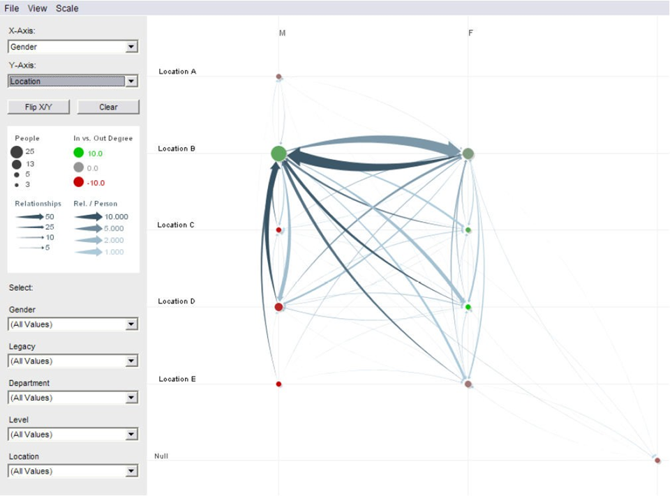
- Information visualization: is the communication of abstract data through the use of interactive visual interfaces. 更像是整个信息的输出,比如拿破仑当年路线的那个经典图。
- Visual Analytics 可视分析:is the sience of analytical resoning facilitated by visual interactive interfaces - keep human in the loop. 另一种定义:Visual analytics combines automated analysis techniques with interactive visualizations for an effective understanding, reasoning and decision making on the basis of very large and complex data sets. 感觉是人与自动分析的结合来处理更复杂的数据集,需要有interface。
这一章的总结:
- 可视化的定义
- Information visualization、Scientific Visualization 的定义、关注什么样的数据
- 上面Research Area以及各学科的区别
2 辛普森悖论 boxplots
Simpson's Paradox 辛普森悖论
失势产生的原因,每个分组的权重不同。
悖论斯坦福讲义里的例子:某大学历史系和地理系招生,共有13男13女报名。历史系5男报名录取1男,8女报名录取2女。地理系8男报名录取6男,5女报名录取4女。
- 历史系:1/5(男) < 2/8 (女)
- 地理系:6/8(男) < 4/5 (女)
合 计:7/13(男)> 6/13 (女)
上面的数据给出一个令人迷惑的结论:尽管每个系女生的录取率都更高,但整体算下来男生的录取率却更高。
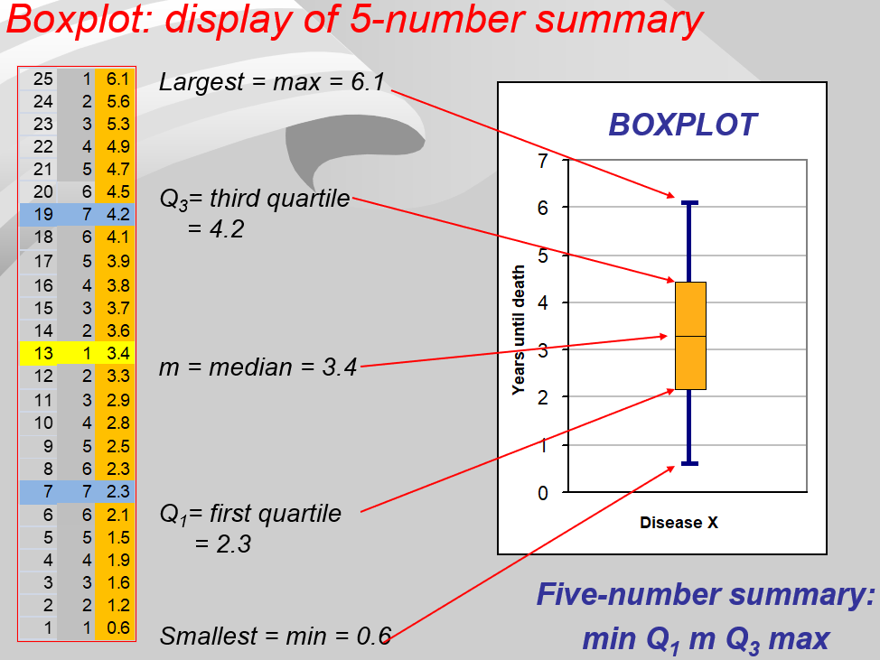
① 计算四分位数 Q1、Q2、Q3,计算公式为 $ Q_i = 1+i*(n-1)/4 $ 其中 Q2=m=中位数,n为数据个数,算出来是数据的位置。 如果不是整数,如2.75,则用0.25*[2]+0.75*[3],[x]表示第x位置上的数。
注意
四分位数位置的计算方法通常有两种(实际维基百科给了4种),这里以0.25处为例
第一种是 (n+1)/4,第二种是 1+(n-1)/4
为什么有多种呢?对于是否包含25%处的点的规定不同、对于如何离散值应该划分区间的范围规则不同…
第一种,为什么是n+1,实际n个数将空间分为了n+1个,若假设总体落在每个区间的概率相同。第二种最好理解,比如 1 2 3 4 5 6 7,则1就是最左端,7就是最右端,则区间实际上是被分成了6块,所以是n-1,然后+1是弥补1之间的序号,需要从0开始数才是正确的位置。
Excel中有两种计算方式分别对应第一种和第二种,
,课件上使用的第二种,d3中使用的第二种。
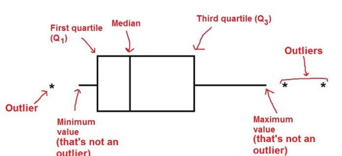
② 计算IPQ = Q3-Q1,则数据的非异常最大值和最小值分别为Q3+1.5IPQ,Q1-1.5IPQ,超过这两个范围的均为异常值。
- 最大值区间: Q3+1.5ΔQ
- 最小值区间: Q1-1.5ΔQ
最大值与最小值产生于这个区间。区间外的值被视为outlier显示在图上.
③ 画线时画出非异常范围内的最大值、最小值、Q1、Q2、Q3。
对于端点的横线,有画的也有没画的,个人建议不画。
可以看的参考:
- https://zh.wikipedia.org/wiki/%E7%AE%B1%E5%BD%A2%E5%9C%96
- d3 template 的 basic 图形似乎有错误,=+*
- https://en.wikipedia.org/wiki/Quartile
- 一个很有启发但是好像不太对的 csdn:https://blog.csdn.net/weixin_53711329/article/details/111936160
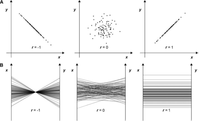
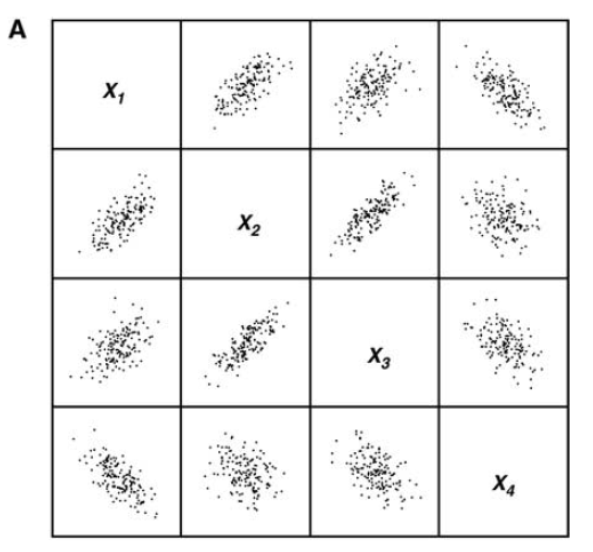
3 平行坐标系
需要掌握:散点图矩阵和平行坐标系的绘制
主要下面这三种,注意再多观察一下图1对应之间的关系,比如反比例对应成一个点之类的。
第二张图是对称的,但是如果x过于多,那么会画太多的图了,所以才可以用图3来代替。
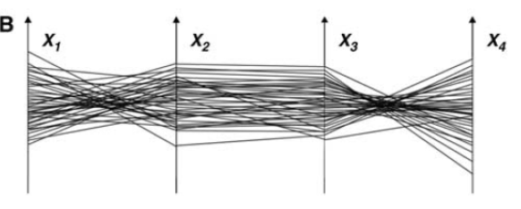
平行坐标系需要的一些问题:
如果太密了看不清楚怎么办?收束捆绑、加不同颜色、颜色变淡……等
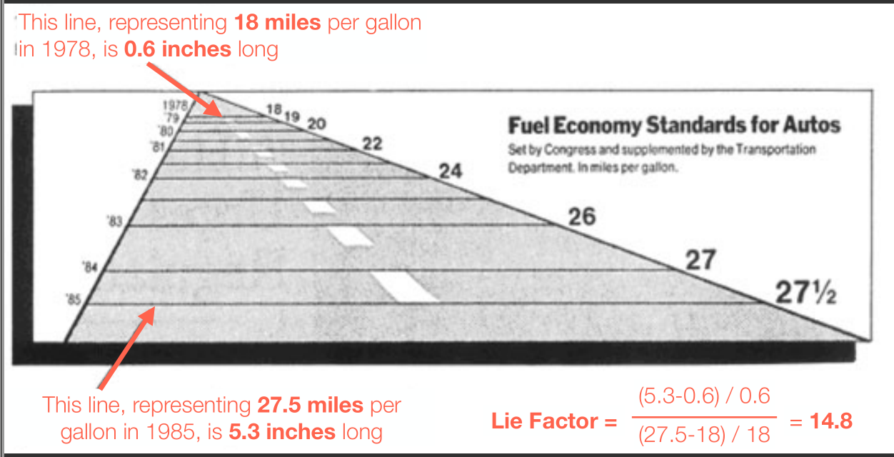
4 vis-guide:Graphical Integrity 图形完整性,Lie factor 谎言因素,data-ink ratio
pdf:vis-guide
目的:评价可视化与使用不同的可视化方法
Edward Tufte’s Design Principles 的设计原则
- Graphical Integrity 数据的完整性
- The lie factor
- Maximize data-ink ratio
- Avoid harmful chart junk
这图的问题:① 横坐标 ② 纵坐标的比例 ③ 标题有误导性
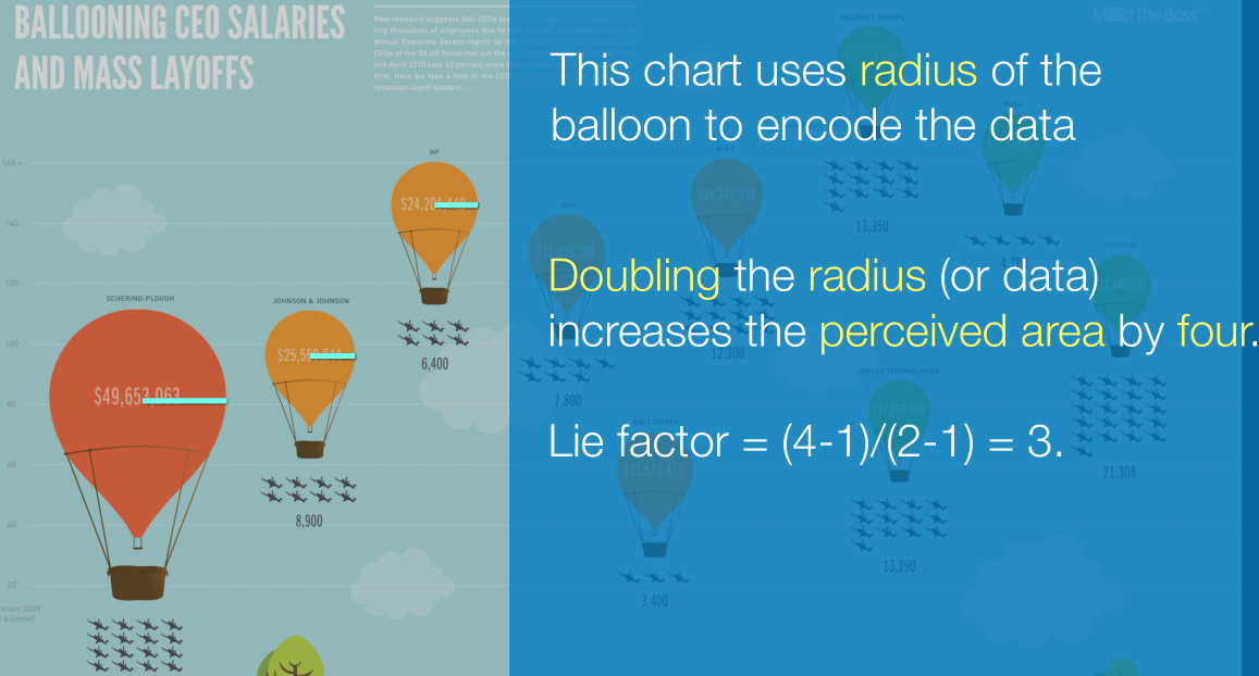
计算 Lie Factor
$ Lie\text{ }Factor = \frac{Size\text{ }of\text{ }effect \text{ }in\text{ }graphic}{Size\text{ }of\text{ }effect\text{ }in\text{ }data} $,$ Size\text{ }of\text{ }effect = \frac{v2-v1}{v1} $
下面这个用面积来表达的,r的平方。
Data-Ink Ratio
用较少的墨水打印更多的数据,但是现在花里胡哨了。
减少chart Junks 比如删掉背景的网格线啊之类的。
Color Maps:颜色不能表示连续性和强弱
5 Color
Color perception 的 pipeline,人眼的对于颜色的处理流程
Light -> Cone Response(椎体响应? -> Opponent Signals 对应的信号 -> Color Perception 色彩感知 -> Color Appearance 色彩的外观 -> Color Cognition 色彩认知
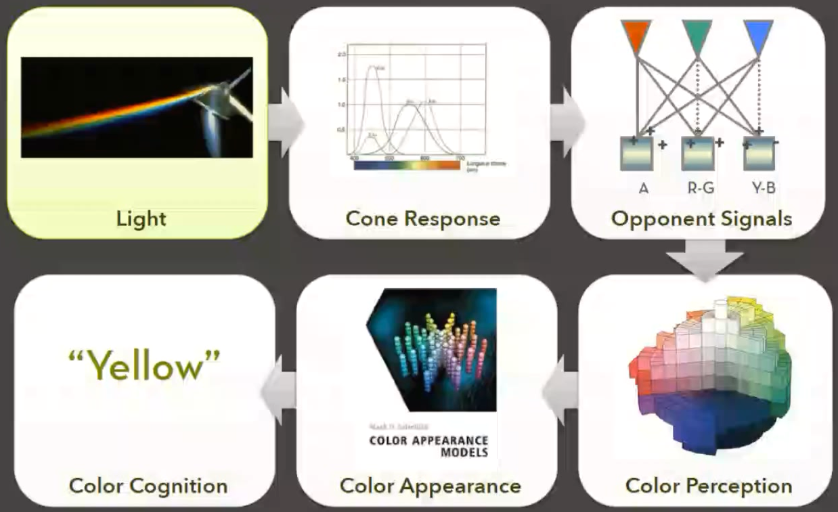
Be Wary of Rainbows 它的一些缺点
- People segment colors into classes 人们习惯将颜色用于分类/等级
- Hues are not naturally ordered 不能表现强度和次序大小 最主要的 (色调不是自然有序的)
- Different lightness emphasizes certain scalar values 翻译:
- Low luminance colors (blue) hide high frequencies 高频的值被藏掉了,比如蓝色
**了解一下的:**构造高品质的Color scale、HSV、CLE颜色模型、Color Space
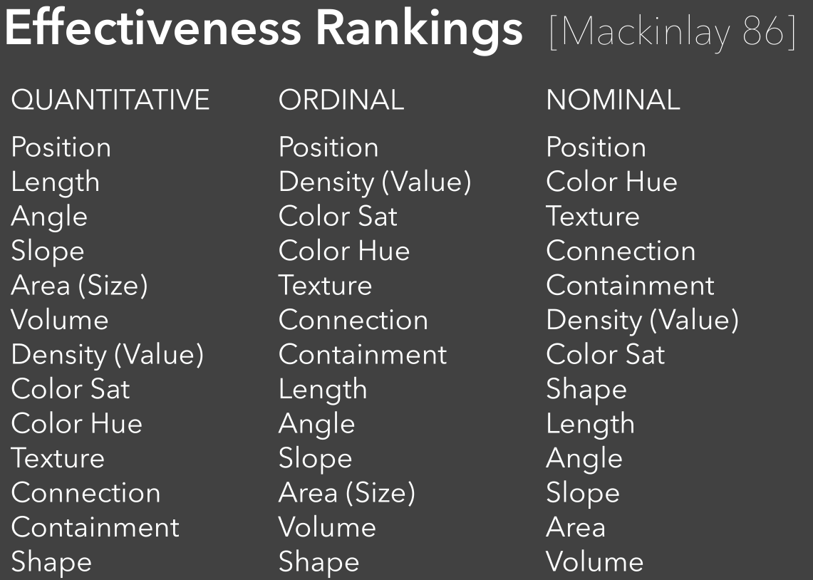
6 Visualization Design Principles; Visual encoding Effectiveness ranking
Design Principles 必须要掌握的,最好用自己的语言可以描述出来
- Expressiveness 可表达性
- A set of facts is expressible in a visual language if the sentences(i.e. the visualizations) in the language express all the facts in the set of data, and only the facts in the data.
- 能把数据里面的事实表达出来而且仅仅是数据里的事实
- Tell the truth and noting but the truth (don't lie, and don't lie by omission)
- Effectiveness
- A visualization is more effective than another visualization if the information conveyed by one visualization is more readily perceived than the information in the other visualization.
- 信息更有效的、更容易的被人感知到,更快和更准确的
- Use Encodings that people decode better (where better = faster and/or more accurate)
对于不同的量度,影响因素有差别
Graphical Perception 的概念
The ability of viewers to interpret visual (graphical) encodings of information and thereby decode information in graphs. Viewers(不一定是人)解释信息编码和在图中解码信息的能力。
**JND - Just Noticeable Difference 的概念 **wiki
最小可觉差, $ {\displaystyle {\frac {\Delta I}{I}}=k, \Delta S= k \frac {\Delta I}{I}} $
$ {\displaystyle I!} $$ {\displaystyle \Delta I! } $k
Gestalt Principles
在格式塔心理学家看来,知觉到的东西要大于眼睛见到的东西;任何一种经验的现象,其中的每一成分都牵连到其他成分,每一成分之所以有其特性,是因为它与其他部分具有关系。由此构成的整体,并不决定于其个别的元素,而局部过程却取决于整体的内在特性。完整的现象具有它本身的完整特性,它既不能分解为简单的元素,它的特性又不包含于元素之内。
格式塔心理学的理论核心是整体决定部分的性质,部分依从于整体。他们通过实验的方式证明感知运动不等于实际运动,也不等于若干的单一刺激,而是与交互作用的刺激网络相关,整体不等于各部分简单相加之和。
“整体不同于其部件的总和”。例如,我们对一朵花的感知,并非纯粹单单从对花的形状、颜色、大小等感官资讯而来,还包括我们对花过去的经验和印象,加起来才是我们对一朵花的感知[2]。
- Figure/Ground 个人理解为负空间、单纯图形线条可以组合出不同的物体
- Proximity 相近性,距离相近的各部分趋于组成整体
- Similarity 相似性,在某一方面相似的各部分趋于组成整体
- Symmetry 对称性,
- Connectedness 连接性
- Continuity 连续性,
- Closure 封闭,
- Common Fate Dots moving together are grouped,如果物理沿着相似的光滑路径或具有相似的排列模式,人眼会将它们识别成一类物体。
- Transparency 透明度原则,要求图形有连续和适当的色彩。
7 PCA MDS t-SNE
pdf: high-dim-vis, 2DEmbedding
minimize an objective function that measures the discrepancy between similarities in the data and similarities in the map
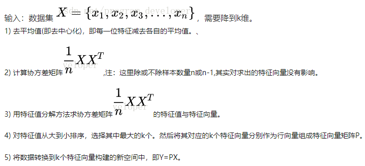
PCA
感觉比较好的解释:方差主成分
[简书](https://www.jianshu.com/p/07f4c2356965)1、去除原始数据的平均值
2、计算原始数据的散度矩阵
3、求解散度矩阵的特征向量和特征值
4、根据特征值的大小,从大到小排序特征向量
5、选取前K个特征向量
6、将原始数据转换到上述K个向量所构建的新空间中完成降维
Metric MDS
[知乎](https://zhuanlan.zhihu.com/p/51441355)(1)计算原始空间中数据点的距离矩阵。
(2)计算内积矩阵  。
。
(3)对矩阵B进行特征值分解,获得特征值矩阵  和特征向量矩阵
  。
。
(4)取特征值矩阵最大的前  项及其对应的特征向量
  。
。
MDS与PCA:
t-SNE
SNE,不同于MDS和ISOMAP中基于距离不变的思想,而是先将欧氏距离距离转换为条件概率,来表达点与点之间的相似度,再优化两个分布之间的距离-KL散度,从而保证点与点之间的分布概率不变。
尽管SNE提供了很好的可视化方法,但是他很难优化,而且存在“拥挤问题”crowding problem。t-SNE在低维空间下使用更重长尾分布的t分布来避免拥挤问题和优化问题。
拥挤问题就是说各个簇聚集在一起,无法区分。比如有一种情况,高维度数据在降维到10维下,可以有很好的表达,但是降维到两维后无法得到可信映射,比如降维如10维中有11个点之间两两等距离的,在二维下就无法得到可信的映射结果(最多3个点)。 进一步的说明,假设一个以数据点xixi为中心,半径为r的m维球(三维空间就是球),其体积是按rmrm增长的,假设数据点是在m维球中均匀分布的,我们来看看其他数据点与xixi的距离随维度增大而产生的变化。
与SNE的区别,对于q,不再用高斯分布,而是用t分布。
还有一些加速方法。
跟PCA的区别,MDS的区别。
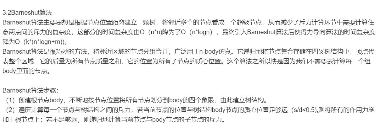
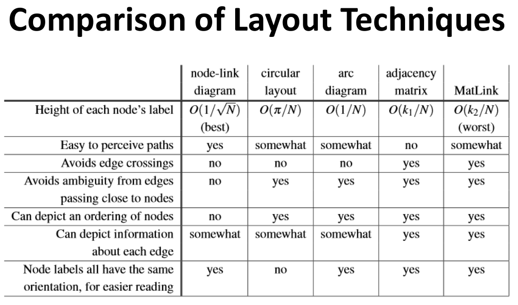
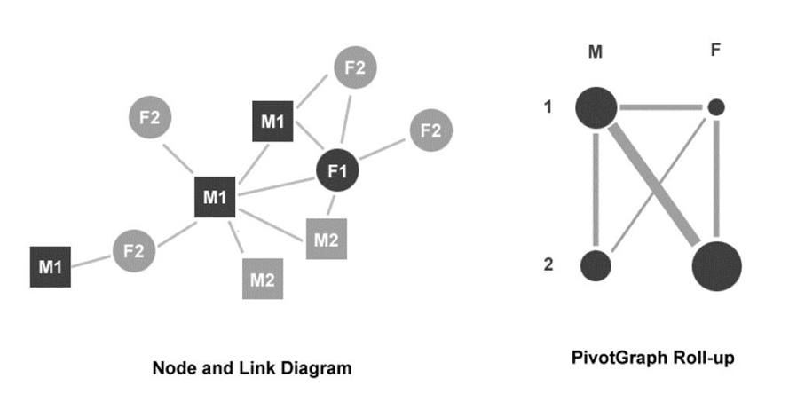
8 Graph Layout force directed, matrix odering
Graph Drawing Aesthetics 画图的美学
- Crossings:
- Minimization of the total crossing number
- Area
- Minimization of drawing area
- Only meaningful to some layout. Example, grid drawing with integer coordinates
- Aspect ratio
- The ratio of the long and short edge length of its covering rectangle
- Ideal case is to obtain any aspect ratio in a given range (so the drawing can fit into differently shaped screen space)
Force-Direct Layout of Graph
每个点看做粒子,相互之间引力和斥力,最后达到一个收敛状态。
现在的O(n^3),起码要掌握O(nlogn)怎么搞,优化策略们。
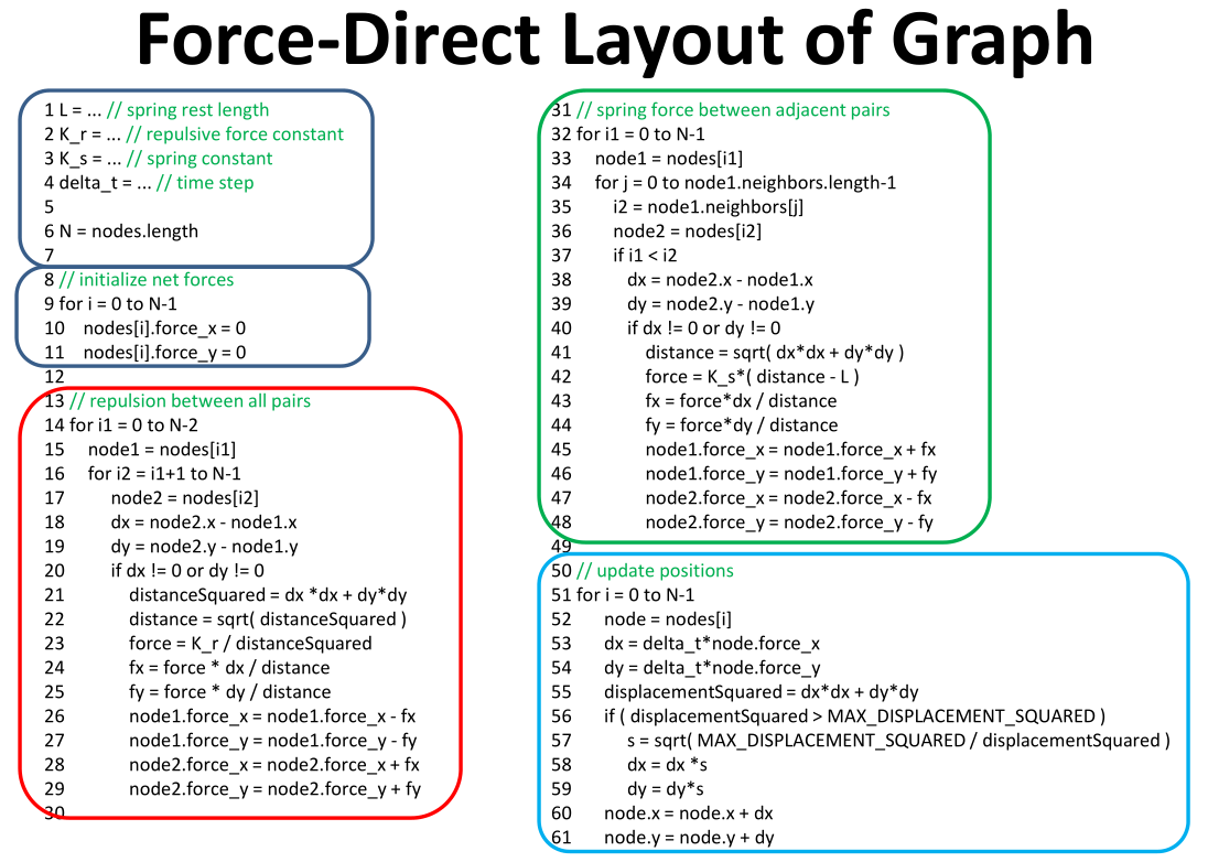
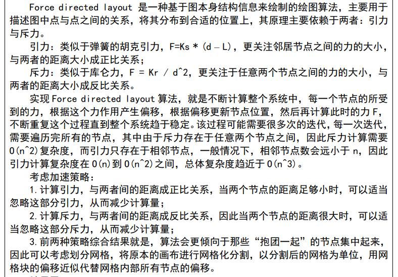
 Force-Direct Layout 的缺点
1. Readability: optimization of aesthetic criteria 可读性
2. Scalability: fast computation 可扩展性
3. Visual complexity: interaction tools that allow users to limit the amount of information displayed on the screen 视觉/交互的复杂性性
    1. overview of the graph
    2. details on demand
    3. user’s mental map preservation
Adjacent Matrix Representations 邻接矩阵 存在的一些问题
不同的ordering对它的影响非常大
不同Layout之间的比较
PivotGr****aph 的绘制和解释
Layout aggregate graphs using node attributes. 使用节点属性布局
9 Tree
Reingold-Tilford Layout
实现+内部细节
Goal: make smarter use of space, maximize density and symmetry.
聪明的利用空间,最大化对称性和密度。
需要考虑的设计:
- encode depth level No edge crossings 设计深度,无交叉边
- Isomorphic subtrees drawn identically 同形子树的画法相同
- Ordering and symmetry preserved 保持有序和对称性
- Compact layout (don’t waste space) 紧凑的布局
设计步骤:
- Initial bottom-up (post-order) traversal of the tree
- Y-coordinates based on tree depth
- X-coordinates set piecemeal via “shifts” at each depth
- At each parent node: merge left and right subtrees
- Shift right subtree as close as possible to the left
- Computed efficiently by maintaining subtree contours
- “Shifts” in position saved for each node
- Parent nodes centered above children
- Final top-down (pre-order) traversal to set X-coordinates
- Sum initial layout and aggregated shifts
Treemap Alogrithm
slicing
Draw() {
    Change orientation from parent (horiz/vert)
    Read all files and directories at this level
    Make rectangle for each, scaled to size
    Draw rectangles using appropriate size and color
    For each directory {
    	Make recursive call using its rectangle as focus
    }
}
Squarified Treemaps 的算法不要求,好处需要掌握 Posited Benefits of 1:1 Aspect Ratios :
- Minimize perimeter,reducing border ink. 减少周长和border ink
- Easier to select with a mouse cursor. 容易被选择
- Similar aspect ratios are easier to compare. 容易比较,但是极端的也并不好。
10 Text
text-doc-vis.pdf
Pipeline
分两个层次
- Macro-level
- Micro-level
**几种可视化方法:**Themescape、TopicLens、ThemeRiver、Sparkclouds、Wordclouds、Word Tree、ParallelTag Clouds
11 交互 interaction
2020-10-210Interaction.pdf
Interaction between people and machines requires mutual intelligibility or shared understanding.
了解可视化里interaction有哪些
需要掌握:
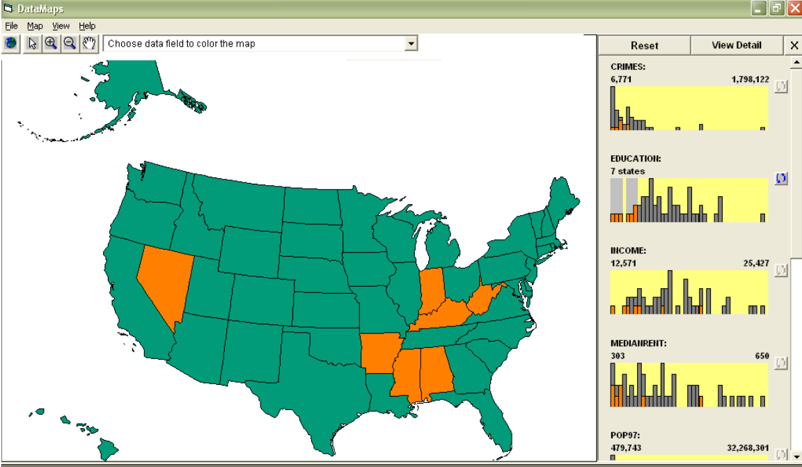
Overview+ Detail
49页 是什么:多视图,同一份数据但是不同的展现形式,比如分辨率的不同,用户可以选择,然后我们把细节展现。
我们需要:Details-on-Demand (DoD)
Provide a viewer with more information and details about a data case(s).
− Get more information about a specific case
− May cause change from an aggregation view to an individual view
Zoom in may result in not all data shown Or data may be abstracted
为浏览者提供能多特定的案例信息,可能会导致从集合视图到个人视图的变化。放大后可能会导致无法显示所有数据,或者数据可能会被抽象化。
Focus + Context
基本理念:The basic idea with focus–plus–context–visualizations is to enable viewers to see the object of primary interest presented in full detail while at the same time getting a overview–impression of all the surrounding information — or context — available. 使Viewers看到感兴趣的部分的全部细节,而且能够看到周围信息/上下文的整体印象。
Three premises 三个前提:
- The user needs both overview (context) and detail information (focus) simultaneously. 用户需要同时知道
- Information needed in the overview may be different from that needed in detail. 概览与细节包含不同信息。
- These two types of information can be combined within a single (dynamic) display, much as in human vision. 这两类信息可以结合在一起。
F+C vs. O+D
一个是 two windows 一个是 merged
Linking and Brushing
不同图之间选择部分的统一性,怎样进行关联。
附录 题型
7个简答题 + 2个画图题 + 1个开放题目
更新: 2021-01-10 14:00:32
原文: https://www.yuque.com/qer233/sdu_note/vis